Color spaces is more than a technical checkbox—it directly shapes how vibrant, accurate, and lifelike your photographs appear. Whether you’re capturing fiery sunsets, lush landscapes, or colorful wildlife, your color space choice can dramatically impact how your final image looks on screens and in print.
Why Color Spaces Matter
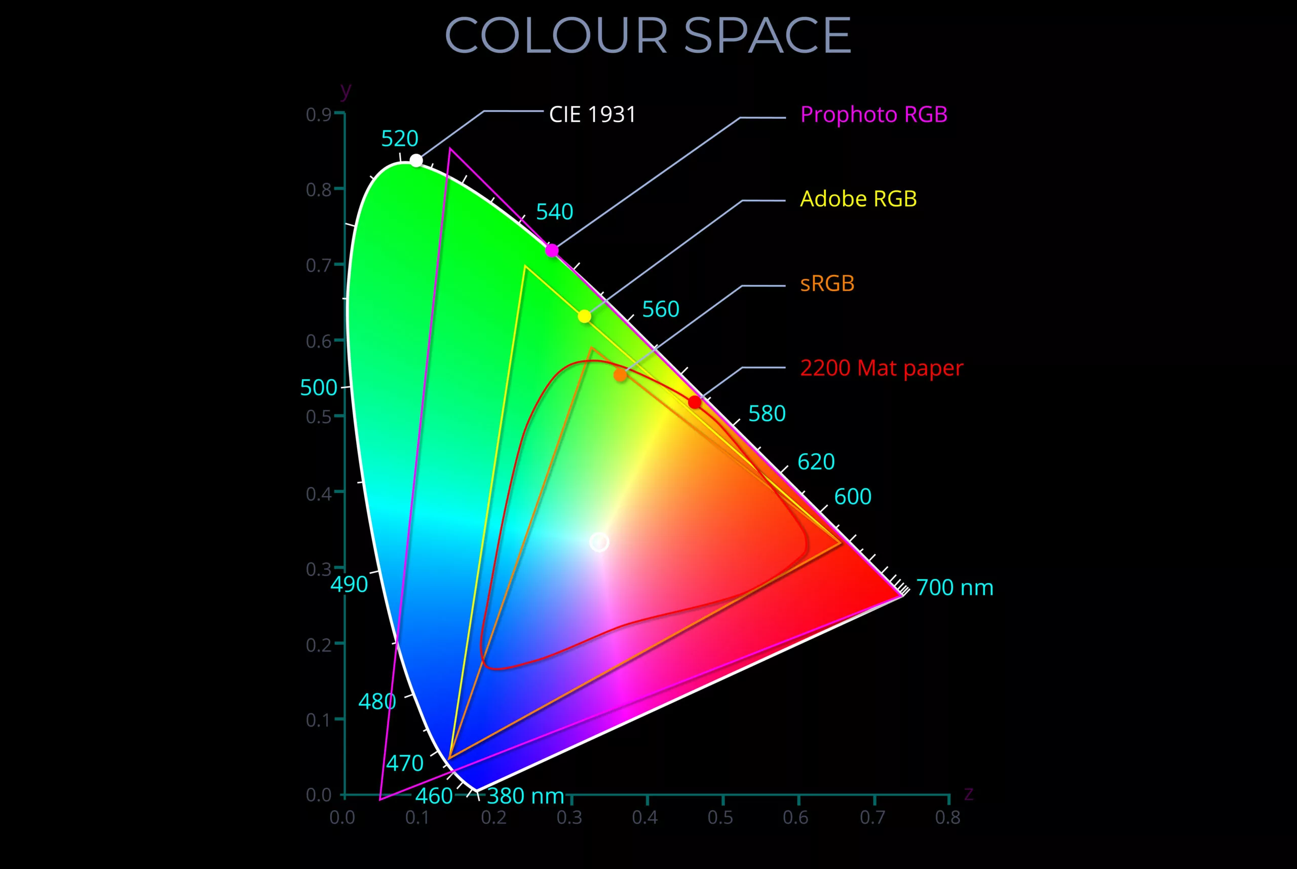
In his insightful video, Greg Benz walks through the practical and theoretical differences between major color spaces like sRGB, Adobe RGB, Display P3, and Rec. 2020. His demonstrations using Mac’s ColorSync Utility visually explain how much color information sRGB fails to capture. He illustrates how broader gamuts, such as Adobe RGB and Rec. 2020, can render significantly more tones—especially in greens, reds, magentas, and cyans.
These differences become even more noticeable in high-saturation scenes. Benz compares images side-by-side to show how sunsets, oceans, or vivid birds can appear richer and more detailed when rendered in wider color spaces.
The 3D Nature of Color Spaces
Color spaces aren’t just about hue and saturation—they’re three-dimensional. Benz highlights an often-missed element: luminosity. This determines how bright a color can get, and it becomes essential when working with HDR displays. Wider gamuts like P3 and Rec. 2020 support higher luminance levels, giving bright scenes—such as sunlit clouds—a more natural look. In contrast, sRGB may produce unwanted banding or loss of subtle gradients in the same areas.
Real-World Editing Impacts
Choosing the wrong color space during editing can backfire. Benz explains how using sRGB or even P3 in Adobe Camera Raw can lead to channel clipping, even before exporting the file. This limits your edit potential, often forcing you to back off your adjustments unnecessarily.
Instead, working in 16-bit with wide-gamut spaces like ProPhoto RGB or Rec. 2020 retains the full range of color detail throughout your workflow. One of Benz’s examples—an edited sunset photo—shows the difference clearly: in sRGB, the clouds appear dull and flat, while in ProPhoto RGB, subtle variations and depth are preserved beautifully.

When to Use Each Color Space
Understanding when and where to apply each color space is just as important. For web use, sRGB remains the most compatible. However, for fine art prints or HDR display outputs, opting for Adobe RGB, Display P3, or Rec. 2020 can make your work shine—literally.
Benz offers practical advice on testing your platforms and export settings to ensure your color profiles are preserved. He even demonstrates how to detect whether your favorite sharing sites support wider gamuts.
Watch the full video here: Color Spaces Explained – Why You Should Care
By becoming more intentional with your color space decisions, you can unlock richer, truer-to-life images and elevate your entire photography workflow.


